
New year, new look: Inside the Zaizi company rebrand
Zaizi are a very people-focused company, using digital to solve real-life problems. That’s why our rebrand puts humans front and centre.
If you’ve visited our website in the last few months, you’ll have noticed it’s had a lick of digital paint. In 2021, our company underwent a lot of changes. We committed to remote working in the long-term, made a raft of new hires and worked on a host of projects for high-profile clients in the public sector. Along the way, we noticed the brand was looking a little dated and decided it was time for a full Zaizi company rebrand.
In this post, some of our employees talk about our rebranding exercise – from our new website, logo and business cards to our approach to presentation and communication. Want to know more about what we do? Get in touch.
Why we decided on a Zaizi company rebrand
Dean Kerrigan, UI/UX Designer: Over the last couple of years, Zaizi has been rapidly expanding. Once, the company was very much developer-led. But more recently we’ve been moving into the service sector, recruiting UX researchers, service designers and content designers. We’re a very people-focused company. During recruitment, we ask people about their values to check they’re a good fit for what we do. We’re all about communicating and solving problems – and we wanted the Zaizi company brand to reflect that.
Added to that, our current website felt dated. We’d heard it was a bit off-putting for people who came to the company looking for jobs. And it didn’t score particularly well on accessibility, which is really important for us as a business making accessible products. So the time was right for a rebrand.
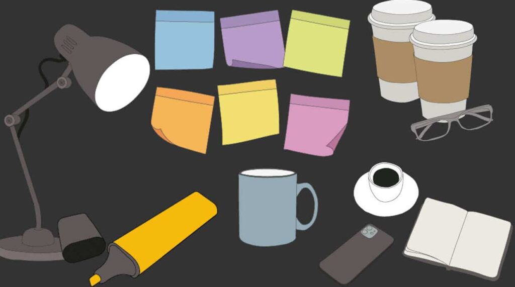
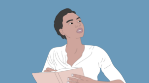
Most important was that the new branding would convey a unique personality that would stand out and be memorable. For the colour palette we went for a mix of earthy and human tones – yellows and greens, oranges and creams. I also created an illustrative style that would run throughout our branding. In the past we made use of stock photos. But we’re a company that provides bespoke, tailored solutions – not off-the-shelf stuff – and we wanted to reflect that.
Our illustrations deliver that sense of people solving problems. They’re all hand-done, and simple enough to be easy to draw and reproduce. It means we can quickly create imagery with a specific project focus.
Rethinking how we present and communicate
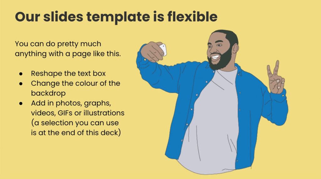
Louis Pattison, Content Designer: Along with the visual rebrand, we wanted to put together a simple toolkit to improve the way we communicate at Zaizi – both internally, and with our customers. One thing we had seen is that everyone at Zaizi presents in a slightly different way. While we had some template slide decks floating around, there weren’t really any consistent rules to follow.
Working with Dean’s new visual style, I put together a new slide deck which doubles as a “how to” guide. In it are tips on clear communication in presentations and approaches to effective slide design. It’s also a repository of useful information such as illustrations. This is all accessible from our #General Slack channel.
We also wanted to think about the best ways to show off the good work that we’ve done. I worked on a brand new case studies section of the website, home for some of the standout projects that we’ve worked on over the last few years, from the work we’ve done for the likes of the Department For Digital, Culture, Media and Sport, the Department of Education and the Ministry Of Justice.
It’s not just a record of the work we’ve done, but how we got there, and – where we’re allowed to share it – the impact that our work has had. It’s also a chance to be honest about the work that we do. What was challenging about a project, and how did we overcome those challenges using the talent at Zaizi’s disposal?
A new Zaizi company logo – and new business cards
Jorjia Burns, UX/UI designer
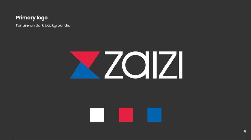
As part of the Zaizi company rebrand we also wanted to look at the logo, which felt synonymous with the old brand. We considered a brand new logo, inspired by the term ‘Zaizi’ – written as 才子 (Cáizǐ) in Mandarin, which means “gifted scholar”. But we decided it was important to communicate we are still the same company, and remain familiar to our existing customers.
Instead of a completely new logo we decided to refresh the existing tangram-style design. The old logo symbolised solutions assembled from open source. components. The new logo takes a more modern, minimalist approach, representing the blending of user experience and tech. We have four colour variants of the new logo, and a new style guide showing how to use it with the new colour palette and fonts.
I have also been working on new business cards that reflect the character of the company. Like the logo, these cards are printed on four colour variants, allowing us to experiment with our new branding and illustrations. Zaizi are a remote company, which means it’s more important than ever to continue real life and face-to-face conversations. The cards give new customers or potential employees all the information they need to get in contact with us. But they’re also designed to show how we can assist people in solving their problems and achieving their business goals.
It all comes back to the message that we are a user-focused company, putting people at the heart of what we do.
-
How Zaizi’s AI sandbox hackathon with NayaOne proved we can build faster and safer
-

Zaizi founder Aingaran Pillai named chair of techUK’s Security and Public Safety SME Forum
-

Zaizi ‘Highly Commended’ for Best Employer at 2025 Computing Women in Tech Excellence Awards
-
Modernising government for AI: What key challenges do departments face?
-

Beyond blueprints: Making government transformation real
-
Zaizi talent shines at Computing DevOps Excellence Awards 2025